The Modern Home Screen — A Full Tour
TORO's modern home screen is where you'll spend most of your day. It's cleaner and faster than the old screen, and it hides a few handy tricks that aren't obvious at first glance. This is the full walkthrough — every region, plus the tap targets most people never discover and how to make the category buttons your own.
Legacy vs. Modern. If your screen still has a menu bar across the very top and tabs instead of a slim icon strip down the left edge, you're on the older layout. This guide covers the modern home screen (the one with the teal header and the left sidebar). Most of what's here applies either way — the difference is mostly where things live.
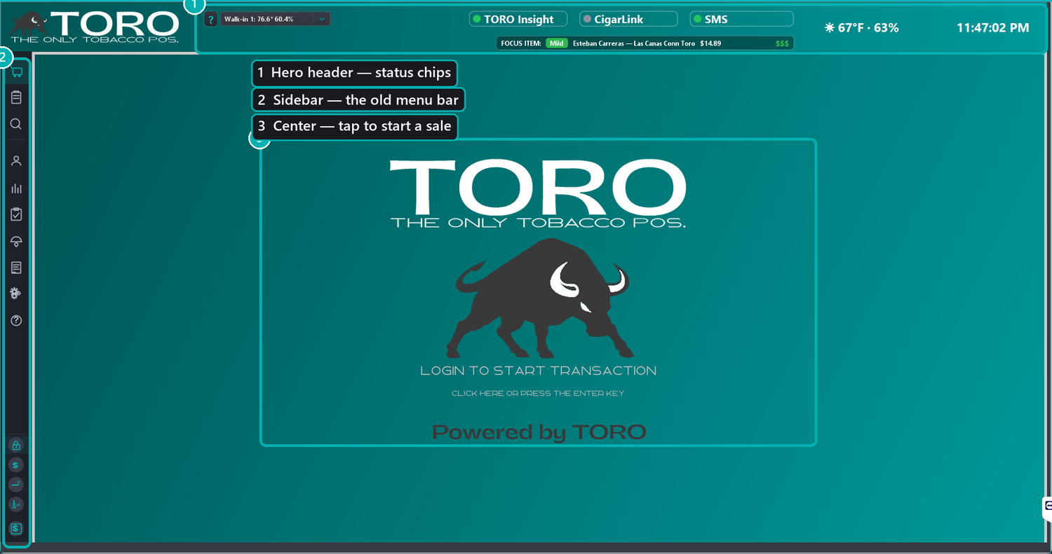
The Big Picture
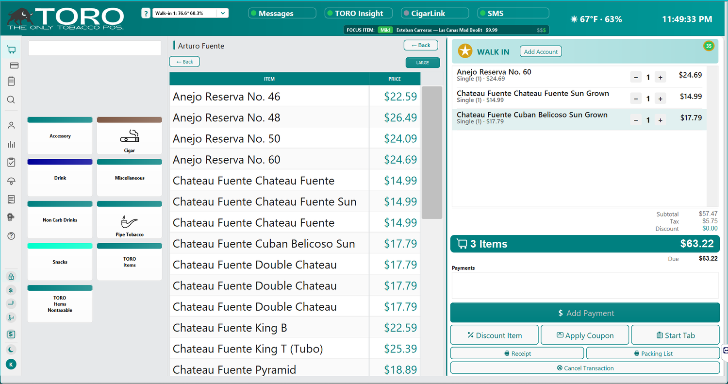
The screen breaks into four areas:
- The hero header — the teal band across the top, with the TORO logo and your status chips.
- The left sidebar — a slim strip of icons that replaces the old menu bar. This is how you get everywhere.
- The center — your login-to-start prompt when idle, and your product buttons and item list once a sale is going.
- The transaction panel (right) — the running receipt and the buttons that move a sale forward. It appears once you start a sale.
Let's go through each one.
1. The Hero Header
Along the top you'll find the TORO logo and a row of small status chips. These are glance-and-go — you don't click most of them, they just tell you the shop is healthy:

- Humidor climate — a live temperature/humidity readout for your humidor sensor. Click it to pick which humidor to show.
- Messages — appears when you have internal messages waiting. It only shows while a sale is on screen.
- Telephone — how many missed calls still need a callback. Green means you're clear.
- TORO Insight — shows whether your data is syncing to TORO Insight.
- CigarLink — shows the status of your CigarLink connection (if you use it).
- SMS — shows your text-messaging status.
- Points Boost — appears when a rewards points boost is running, or when the next one is coming up.
- Weather — today's conditions, handy context for a humidor shop.
- Clock — the current time, so you always know which register you're standing at and that it's set correctly.
- Age cutoff — the small
21 → 07-10-05line under the clock. It's the birth date a customer must be born on or before to buy tobacco today, worked out fresh every day so you never have to do the math at the counter.
Not every chip appears on every register — some belong to features you may not have turned on, or that aren't part of your plan. See Rearranging your top bar below to find out what the rest of them do.
Just under the chips is the Focus Item strip — a rotating spotlight on a cigar worth mentioning to the customer (with its strength and price), and a small ? button at the far left opens help. If a status dot isn't green — say Insight or CigarLink — that's your early warning to check the connection before it becomes a problem.
Rearranging your top bar
Right-click (or press and hold) the TORO logo and choose Rearrange Header. Sales pause while you're arranging, and you'll see:
- Every chip you own, even the ones that normally come and go — Messages, Points Boost, and the Focus Item strip all appear with sample text so you can drag them to a permanent home instead of waiting to catch them on screen.
- Gridlines you can show, resize, and snap to, so everything lines up evenly.
- A list of chips you can't place, underneath the Lock Header button — split into the ones you've switched off in your settings, and the ones that aren't part of your plan. Tap any of them to read what they do.
Drag tiles wherever you like, then tap Lock Header to save. The arrangement is shared by every register in your shop, and only your main station can change it. Reset to TORO Factory Defaults puts everything back.
Note: Chips won't cross onto the TORO logo — drag one to the far left and it stops at a marked line. That's on purpose, so your logo always stays readable.
Turning the age cutoff on or off: it's a setting under the Config menu. If it's switched off, you'll find it listed in the Rearrange Header screen with a link back to this article.
2. The Left Sidebar — Where Everything Moved
This is the single biggest change from the old screen. Everything that used to live in the menu bar across the top now lives in the sidebar down the left. It stays slim (just icons) to keep your screen clean, and expands to show labels when you hover over it (or tap it on a touchscreen).
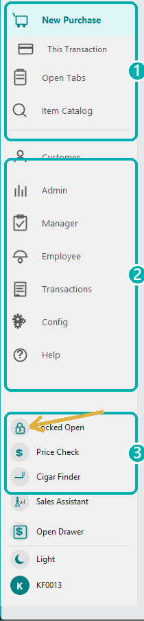
The sidebar has three groups, top to bottom.
Top group — your main workspaces
These switch what you see in the center of the screen:
- New Purchase — start and ring up a sale. (If you're at the idle screen, tapping this starts a new transaction.)
- This Transaction — appears only while a sale is in progress, for actions on the current transaction.
- Open Tabs — see and manage tabs customers have running.
- Item Catalog — search and browse your whole inventory; open any item for its details.
Middle group — the old menus
Each of these opens the same menu you knew from the old top menu bar — nothing was taken away, it just moved here:
- Customer — find accounts, gift cards, create members, scan an ID.
- Admin — Dashboard, payroll, inventory totals, sales tax, safe & bank deposits, daily totals.
- Manager — representatives, checklists, drawer functions, purchase orders.
- Employee — clock in/out, sales assistant, hours, commissions.
- Transactions — discounts, tax-exempt, tips, refunds, and more.
- Config — Single User Mode, font size, sidebar options, and display preferences.
- Help — help resources (and, until the switchover date, the option to revert to the legacy screen).
Tip: If you're hunting for something you used to reach from the old menu bar, it's almost certainly under Customer, Admin, Manager, Employee, Transactions, or Config — same names, same items, just in the sidebar now.
Bottom group — quick actions and the lock
At the very bottom sit the tools you reach for constantly, plus one control most people miss:
- The lock circle — controls how the sidebar behaves (see below).
- Price Check — look up a price without starting a sale. It's also on the Dashboard's Items tab, so you can reach it from the back office too — both open the same window.
- Cigar Finder — the cigar recommendation tool.
- Sales Assistant — the analytic selling assistant (spotlights overstocked cigars to move).
- Open Drawer — pop the cash drawer.
- Theme toggle — the sun/moon icon switches between light and dark mode for your login.
- Your user — the initial + employee ID at the very bottom shows who's signed in.
The hidden gem: the sidebar lock
At the very bottom of the sidebar is a small padlock circle. Most people never touch it, but it controls how the sidebar behaves — tap it to cycle through three modes:
- Auto (open shackle) — the default. Slim by default, pops open when you hover, collapses when you move away.
- Open (closed padlock, "›") — pinned open so the labels always show. Great while you're learning where things are.
- Collapsed (closed padlock, "‹") — pinned slim, never pops out. Great once you've got the icons memorized and want maximum screen space.
Set it to Open for your first week or two — having the labels always visible makes the whole screen easier to learn.
3. The Center — Idle and During a Sale
When no sale is running, the center shows a big "Login to Start Transaction" prompt. Tap it (or tap New Purchase in the sidebar) and you're ringing someone up.
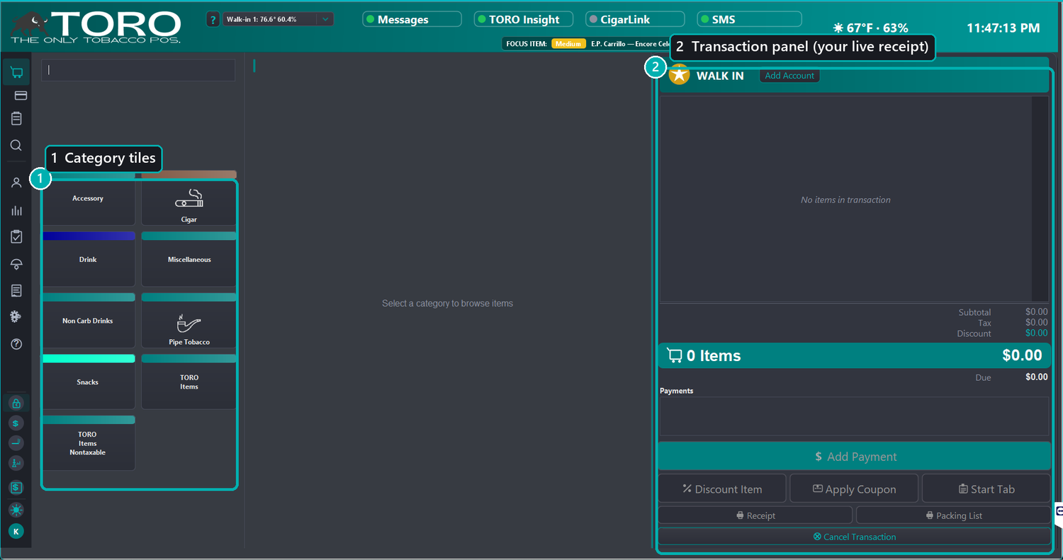
Once a sale starts, the center fills with your product category buttons (the tiles) and, when you pick a category, the items inside it. Full details on ringing up a sale live in Running Your First Sale — here we'll focus on the tiles themselves, because you can customize them.
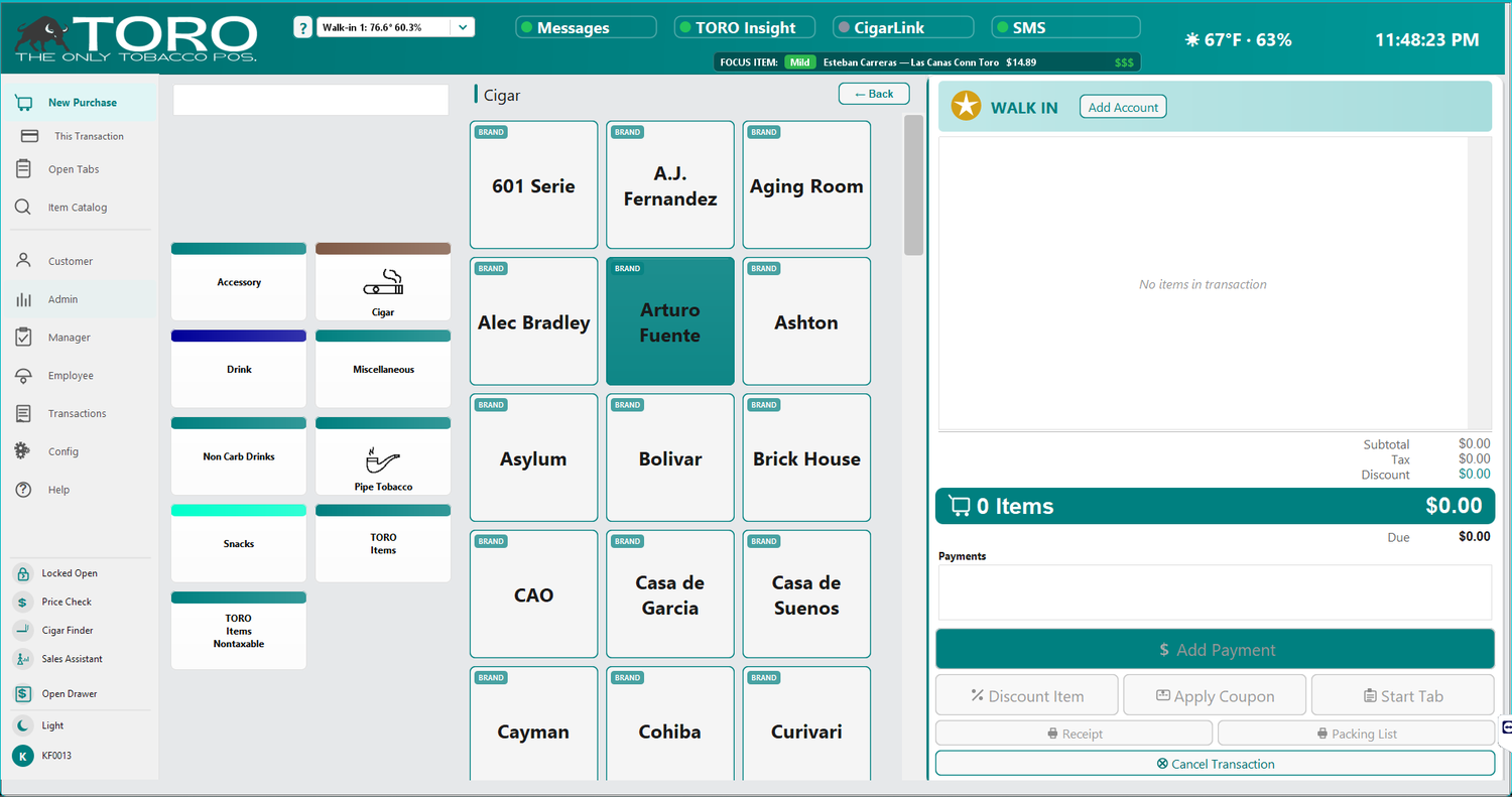
Tap a category and TORO drills in. For a category set to group by brand, you'll see a grid of brand tiles first; tap a brand to see its cigars.
Once you're looking at a list of items, the LARGE button in the top-right blows the list up to big, easy-to-read rows — handy across the counter or on a busy night.
4. The Transaction Panel — and Two Tap Targets People Miss
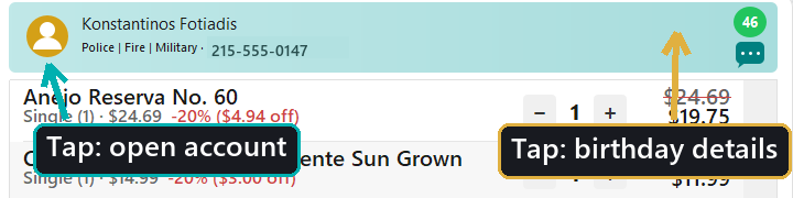
The right side is your live receipt: every item, the running total, and the action buttons (Payment, Hold, Customer, and so on). At the top of it sits the customer strip, and it holds two small controls that are easy to walk past.
The profile / avatar circle (tap to open the account)
On the left of the customer strip is a round avatar:
- On a walk-in sale it's a gold star labeled "Walk In," with an Add Account button beside it.
- Once a customer is attached, it becomes their profile circle with their name and phone.
Tapping the avatar opens the account — the same as the Add Account / View Account button. It's the fastest way to attach a member at the start of a sale or to jump into the attached customer's account mid-sale. Give it a tap; a lot of staff never realize it's clickable.
The age circle (tap for the birthday details)
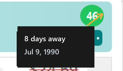
On the right of the customer strip, once a customer with a birthday on file is attached, you'll see a small green circle with their age in it. This is your at-a-glance age check for tobacco sales.
- If the customer's birthday is yesterday, today, or tomorrow, the circle gets a gold ring so you notice it.
- Tap the age circle and a small popup shows the birthday details — how many days until (or since) their birthday, the date, and their age.
- On their actual birthday, tapping it pops a "Happy Birthday!" greeting — a nice touch to make a regular's day.
Customizing Your Category Buttons
The category tiles aren't fixed — you can change how each one looks and reorder or hide them. This is worth doing: a well-organized, color-coded button grid makes ringing up walk-in lounge sales much faster.
To edit a button, right-click it (on a touchscreen, press and hold the tile). A small menu appears with two choices:
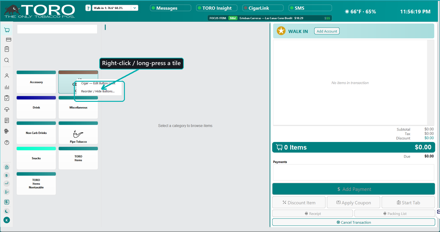
Note: Editing buttons requires the product-type edit permission. If the menu doesn't appear, an owner or manager will need to grant your login access (see Access Levels and Permissions).
"Edit Button Look"
The first option opens the Edit Menu Button editor, organized into four sections (numbered in the picture):
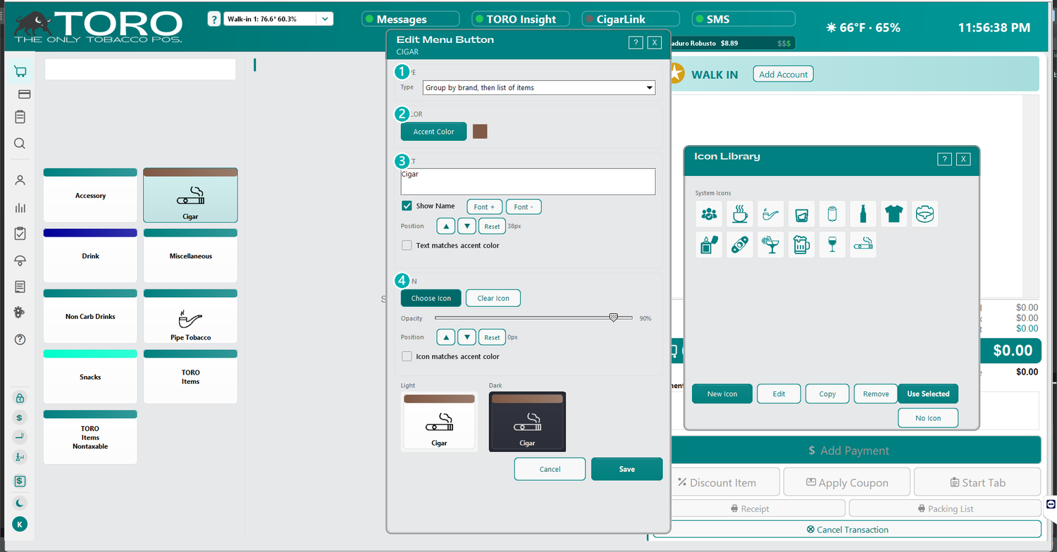
- Type — how the button behaves when tapped: jump straight to a list of items, or group by brand first (a grid of brand tiles, then items).
- Color — the tile's accent color (the bar across the top of the tile). Color-coding your categories — say, greens for accessories, warmer tones for cigars — makes them faster to find at a glance.
- Text — the label itself, whether to show the name, the font size (Font + / Font –), its vertical position, and whether the text matches the accent color.
- Icon — pick an icon to sit behind the label as a subtle watermark, set its opacity, nudge its position, and choose whether it takes on the accent color. Choose Icon opens the Icon Library, where you can use a built-in system icon or create your own.
A live preview shows your changes in both light and dark mode as you make them, so you can be sure the tile looks good either way. Save when you're happy, and the grid updates immediately.
"Reorder / Hide Buttons"
The second option opens the reorder tool for this station.
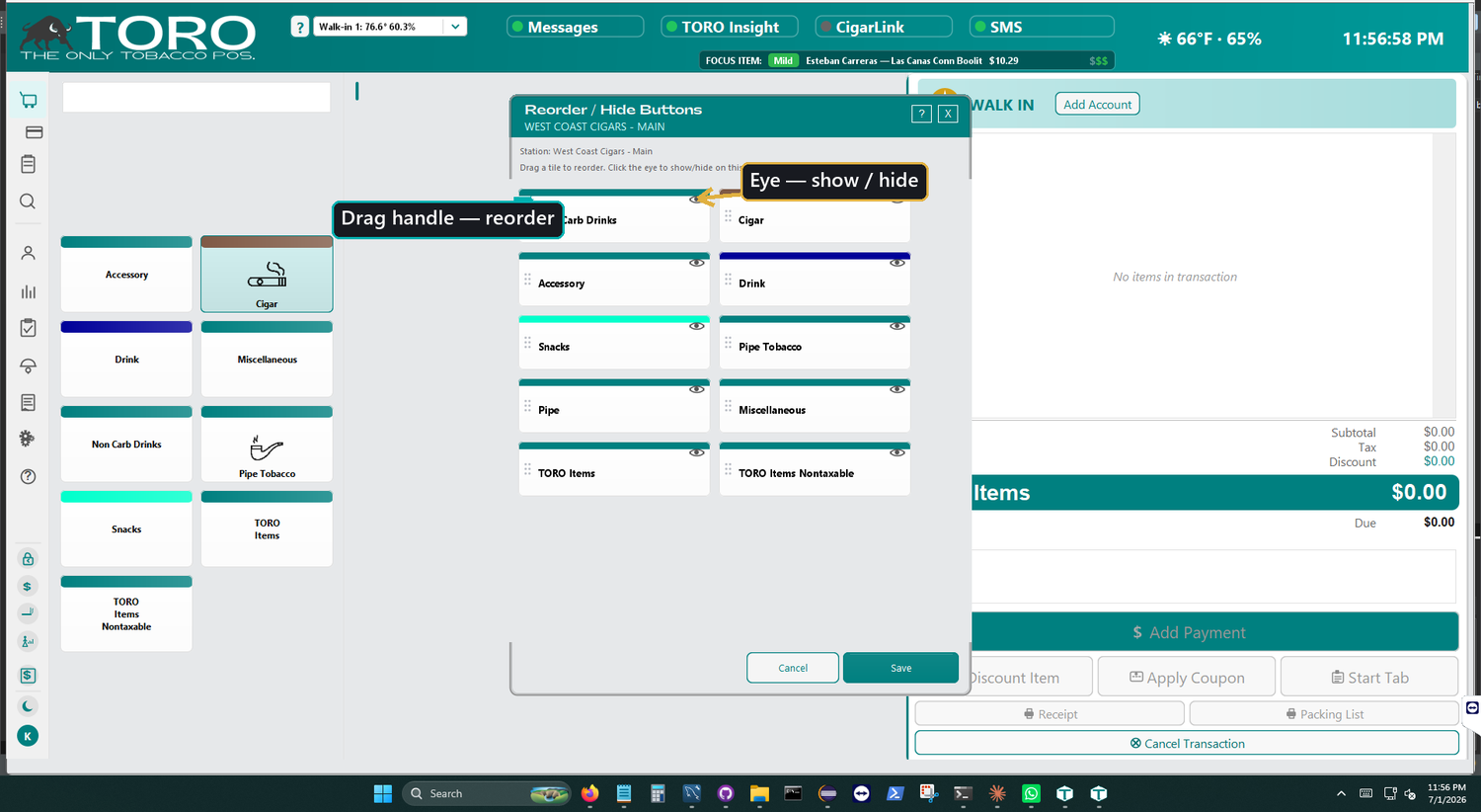
Drag a tile by the handle on its left to put your categories in the order you want, and click the eye on a tile to show or hide it. Hiding a category here only removes its button from this station's screen — it doesn't delete the category or its items, and other stations keep their own layout.
Quick Recap
- Everything from the old menu bar is now in the left sidebar — Customer, Admin, Manager, Employee, Transactions, Config, Help.
- Hover (or tap) the sidebar to see labels; use the padlock at the bottom to pin it open while you learn.
- Tap the avatar to open the customer's account; tap the age circle for birthday details.
- Right-click (or long-press) a category tile to recolor, rename, re-icon, reorder, or hide it.
Once these become second nature, the modern screen is genuinely faster than the old one — and a lot nicer to look at all day.